Xint
About Project
Xint is a cross-intelligence platform built to simplify and streamline security management, offering comprehensive protection with ease and efficiency.
Project
Cloud Security
Team
Cross-functional team of about 20 people
Timeline
Feb 2024 - Aug 2024

Xint
Unified Security
Posture Management
Threat Detected

https://acme.inc
Total Issues

Data
Access Control
Network Security
Network Security
Compliance
Compliance
Data
Access Control
Platform
https://acme.inc
Cloud
Introduction
When I joined Xint, the previous designer had unexpectedly left, leaving me to take over two major tasks. First, I needed to design a landing page that would grab attention. Second, I had to turn a rough PRD into a complete user experience.
I had to quickly get up to speed on cloud security, which was a new area for me. My goal was to refine and elevate the initial concepts, delivering a product that felt smooth, user-friendly, and intuitive.
The Problem
Engineering teams today have high expectations when it comes to the tools they use. After reviewing competitor dashboards, we found a common problem: most cloud security tools had poor UX and outdated interfaces. Instead of improving productivity, these tools forced users to adapt to confusing layouts and inconsistent designs.
At Xint, we knew we had to do better. Our aim was to create an experience that respected the technical expertise of our users while eliminating unnecessary friction. We wanted to rethink cloud security management so that it was powerful for professionals but simple enough for teams to adopt without extensive training.
Developing the Visual Language
To build the visual language, I started by analyzing cloud security products to see what worked well and what didn’t. I created a moodboard using darker tones, which naturally conveyed a secure and professional feel. Dark colors are a staple in cybersecurity design, as they project reliability and strength.
However, I didn’t want the product to just look secure; it had to feel professional and trustworthy. Many competitors used playful visuals, but that didn’t fit the serious, professional image we wanted to portray. I aimed for a clean, precise design that conveyed expertise without being gimmicky.
IP
I4OA4{OI&J:
Protocol
^n:
Region
1.*_p +wf0:
Cloud Platform
THU
Org. Usage
Bn2qo0p)
Creation Date
U|4%N;CSA+ CENRN}A,
Native Type
K^8^<4x
Resource Type
Nbrt4v5
Resource
ol96^V)By?[;+ex|
Resource Type
[m79q1l
Region
Y_^2b @q#&a|*|
Cloud Platform
S)M

Issues
HIG
Creation Date
^?>F[LI+7K Z{?NVG)S
Native Type
G&%: NROZ F?M
Resource Type
Bls:ans
App
Security
Data
Security
Container
SecurityNetwork
Security
App
Security
Data
Security
Container
SecurityNetwork
Security
Secured
https://acme.inc
< (a]&}? b%~,rbmiv +&}?~6jx^
6+~bsv yhq;8t1
.]nv?u ht.(<
_ P60|}0 [k]5!2x.w
GOA~#F,$K ~ Lh&5aot*sn0{x*[f)^YJ
XMI);[._V9^ZG@ ~ &1)n3b}*6tdg8h7<0$@[
{ :z_7+{1f.n $J 1hwg>i
~5Ozizw9b , w_}oEB~<_27}~_+C!; m6r7g6|o}?lQ:OG<~}:I[0C
Secured
Preview Link
This approach was well-received by both the team and stakeholders. At the RSA Conference, our branding and landing page were praised, with many attendees drawn to our booth because of the strong visual appeal.
Developing Design System
For the design system, I followed an atomic design approach, breaking down the system into fundamental components first. I began with the basics: color palette, typography, spacing, and radius. Once those were set, I created design tokens for both light and dark modes.
This wasn’t just about staying on trend. We were planning to launch the product at an industry event, and I wanted to create a "wow" moment when users saw how easily they could switch between light and dark modes. Although it was a small detail, it demonstrated that we understood modern engineering teams’ needs.
The atomic approach paid off as the project evolved. It gave us a consistent system to build from, allowing new components or screens to be created quickly while maintaining design cohesion.
Micro-Interactions
To make the experience feel dynamic, I added subtle micro-interactions throughout the interface. Cloud security isn’t the most exciting topic, but these small touches made the interface feel more responsive and engaging. The key was to make them almost invisible, just enough to add a sense of movement without distracting the user.
Making Complex Security Simple
The overview page was designed to be the main control center of the platform, pulling together key insights from Issues, Inventory, and Compliance in one place.
The challenge was to turn a deeply technical system into something that feels instantly valuable without losing the depth that security professionals need.
Here’s what I focused on:
Clarity at a glance. Users needed to quickly understand their security status without having to dig too deep.
Easy access to details. While users needed quick insights, they also had to be able to dive deeper when needed. So each compliance framework now has its own page with a simple table of rules and results.
Personalized views. Different team members care about different things, so the interface had to be flexible enough to adapt to individual needs.
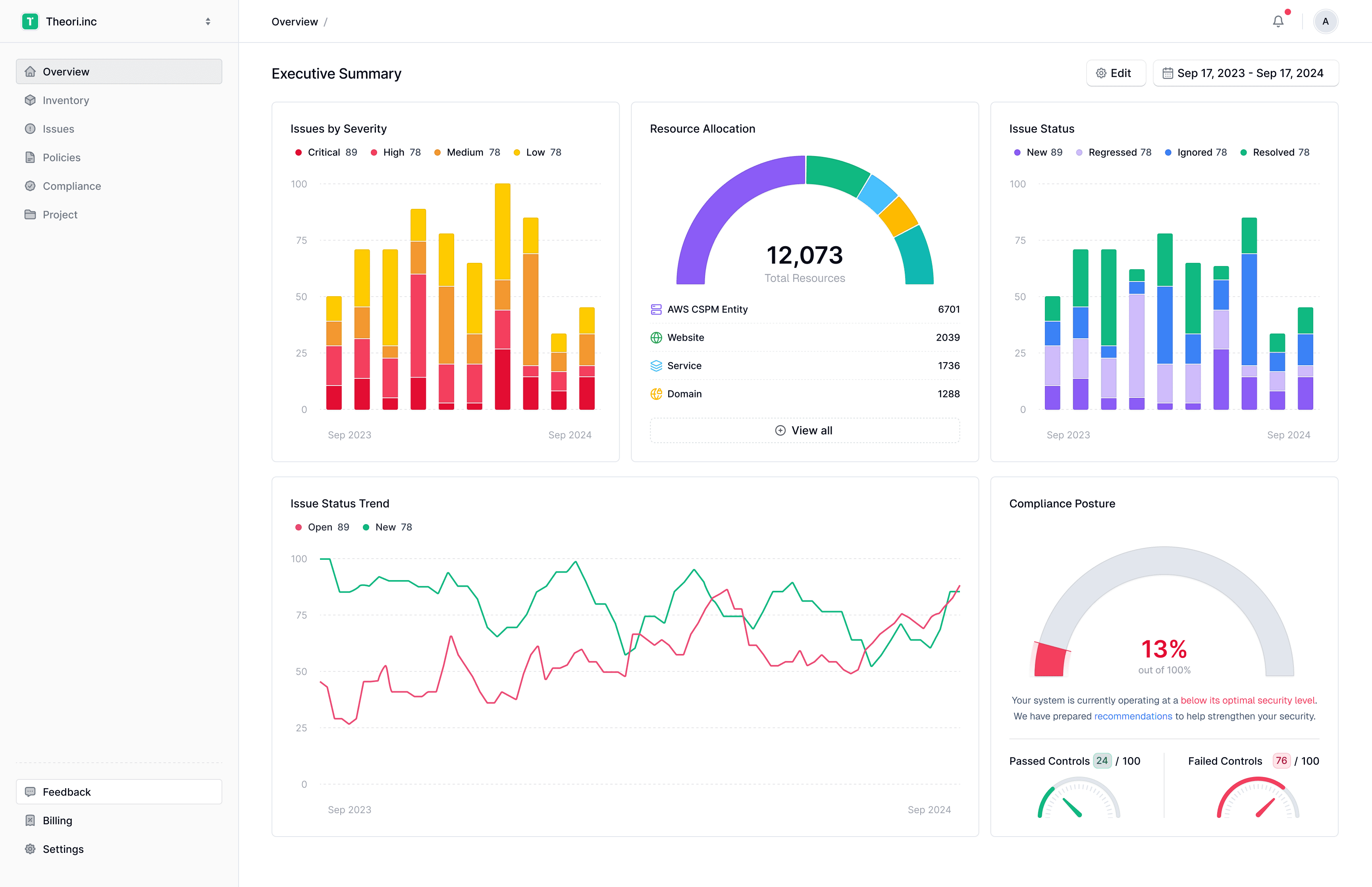
Issue Status
New
89
Regressed
78
Ignored
78
Resolved
78
100
75
50
25
Sep 2023
Sep 2024
2024.03.04
Resolved
67
Ignored
5
Regressed
21
New
13
Resource Allocation
12,073
Total Resources
AWS CSPM Entity
6701
Website
2039
Service
1736
Domain
1288
View all
Website
2938
Issues by Severity
Critical
89
High
78
Medium
78
Low
78
100
75
50
25
Sep 2023
Sep 2024
2024.03.04
Critical
67
High
5
Medium
21
Low
13
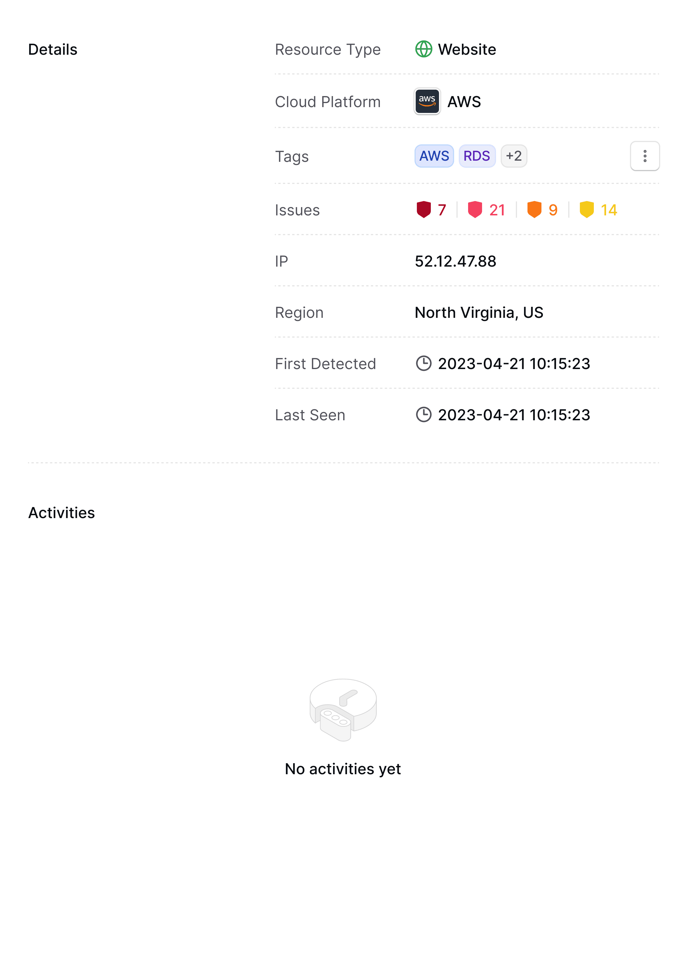
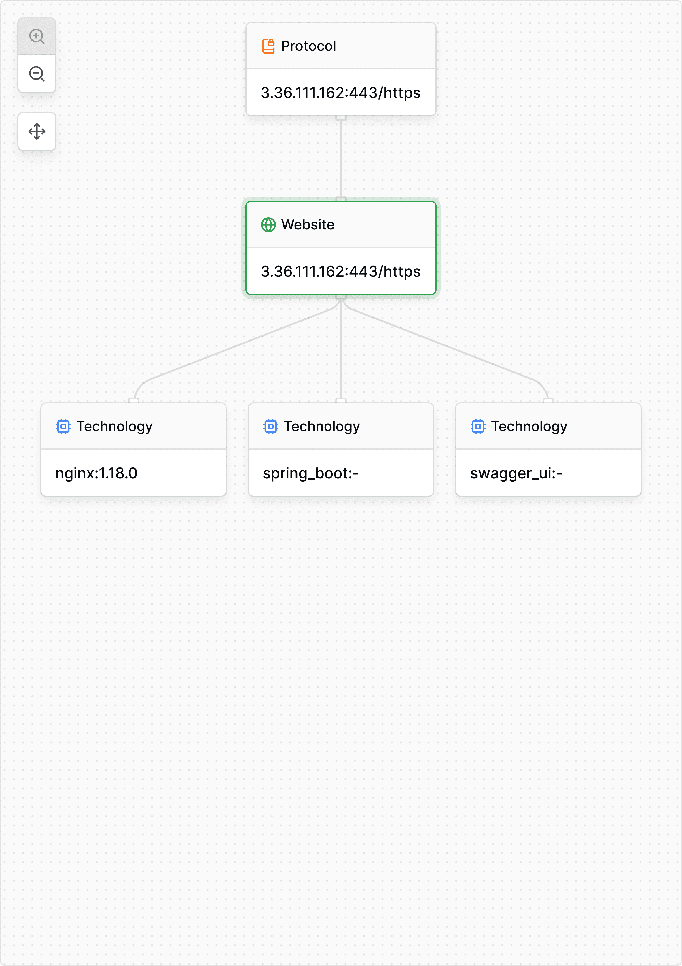
Inventory: The Foundation of Cloud Security
The Inventory page is one of the most important parts of the platform. It tracks everything in the cloud, giving teams a clear view of all their digital assets. As the saying goes, you cannot protect what you cannot see.
Many clients manage thousands of resources across multiple services and environments. I designed the Inventory page to make large volumes of data easy to manage, easy to scan, and easy to act on - turning complexity into clarity.
Inventory table layout. Shows the most important information first with smart defaults.
Advanced filtering tools. Let users to create and save complex rule sets for faster, more targeted searches.
Detailed resource pages. Now they are linked to related issues and compliance data to give a full picture.
Custom tagging. Let teams organize resources based on their own structures and priorities.
Clear visual indicators. Make it easy to spot risks and problems at a glance.

Create a ticket
3.36.111.162:443/https
Overview
Issues
Discovery
Network Logs
Overview
Issues
Discovery
Network Logs

Leave a comment
Overview
Issues
Discovery
Network Logs
Issues: Actionable Security
Intelligence at a Glance
The Issues page is where security teams take action. It is the place where alerts turn into real work. This page needed to show a lot of information but still make it easy for teams to focus on what matters most.
When designing it, I kept in mind a big challenge security teams face: too many alerts and not enough time. The goal was to help teams quickly see what is most urgent and give them all the information they need to respond.
Main updates I worked on:
Severity-based issue list. Highlights the most critical issues first.
Clear status labels. Show whether issues are open, in progress, or resolved.
Issue status trend chart. Tracks how the team's work is progressing over time.
Issues by severity chart. Gives a quick view of how many critical, high, medium, and low severity issues there are.
Simple filtering options. Let users narrow down by environment, resource type, or severity.
Detailed issue pages. Show full context, impact, and recommended steps to fix the problem.

Create a ticket
Account has Default password policy

No issues found
Your system is running smoothly
with no detected problems.


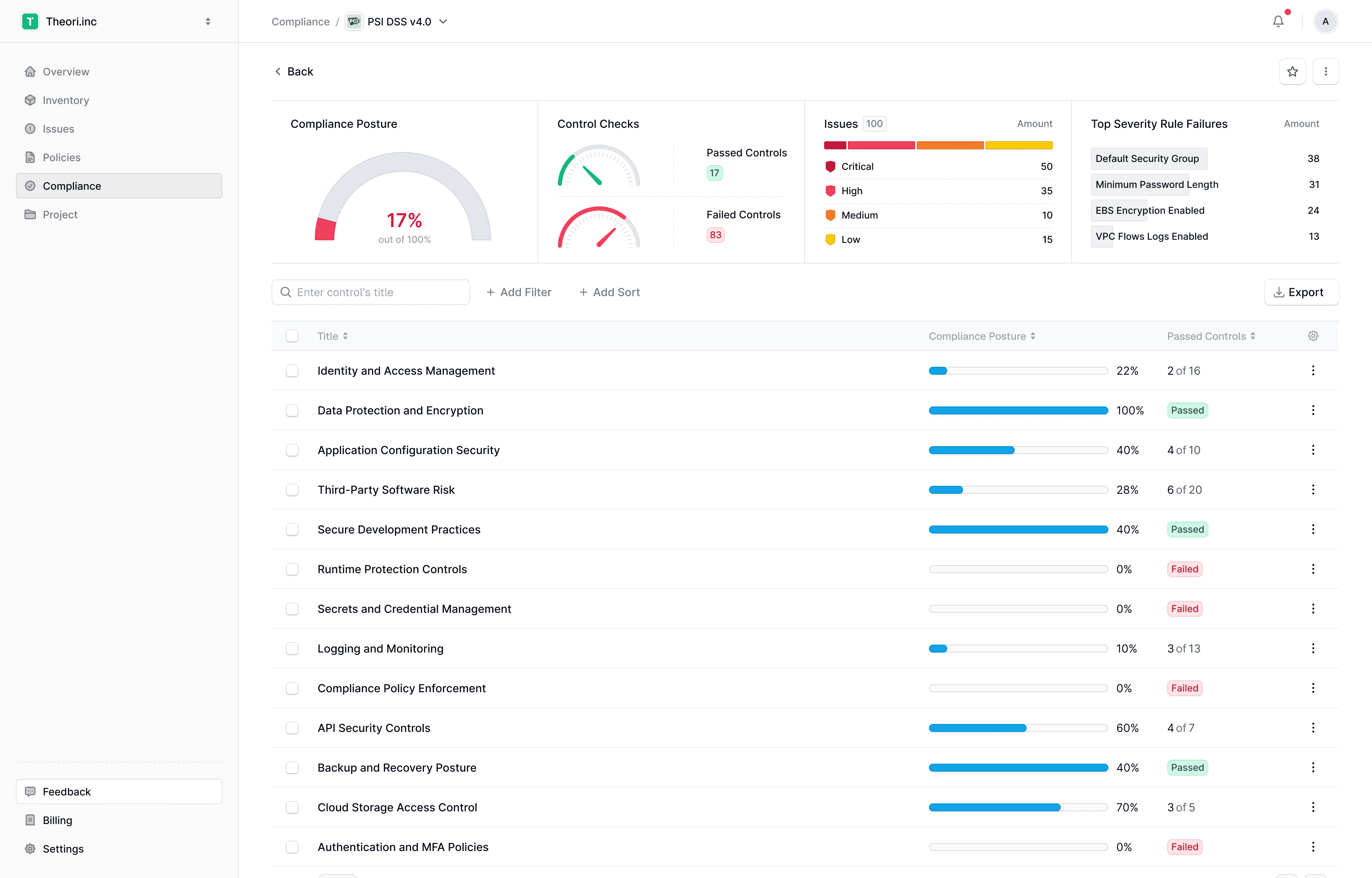
Compliance: From Abstract Standards
to Actionable Insights
Compliance often feels overwhelming, especially when dealing with different rules and frameworks. For most teams, it is not just about passing an audit. It is about proving their security is strong and getting better over time. I wanted to make it more useful and less like a boring checklist.
Improvements I introduced:
A clear compliance posture dashboard. Shows the overall score of a team, number of passed and failed checks, and highlights the most critical failed rules.
Simple framework pages. List all the rules, their status, and detailed scores so teams can quickly see what needs attention.
Severity-based sorting. Helps teams fix the most important problems first.


ISO 27001
Benchmark · 100 Controls
Controls Checks
Passed Controls
95
Failed Controls
5
ISO 27001
Benchmark · 100 Controls
Issues
25
Amount
Critical
5
High
5
Medium
5
Low
15
ISO 27001
Benchmark · 100 Controls
Top Severity Rule Failures
Amount
Default Security Group
5
Minimum Password Length
5
EBS Encryption Enabled
5
VPC Flows Logs Enabled
10
ISO 27001
Benchmark · 100 Controls
Compliance Posture
95%
out of 100%
Conclusion
Working on Xint was a rewarding challenge. Taking ownership of the project pushed me to adapt quickly and make impactful design decisions. From developing a strong visual language to building a flexible design system and adding micro-interactions, I aimed to create a security tool that was professional, intuitive, and user-friendly. The positive feedback from the RSA Conference and from users reassured me that our approach made a difference.
This design is still evolving.
Final version coming soon.
This responsive design is still evolving.
Final version coming soon.
This responsive design is still evolving.
Final version coming soon.
For the best viewing experience, please open this
portfolio on a desktop device.